A Simpler Tutorial on Jupyter (IPython) Widgets
Jupyter widgets are an awesome tool for creating interactive dashboards, but documentation can be a little excessive if you’re just looking for basic functionality. It really doesn’t have to be so complicated.
Our widget use-case
My data visualization team wanted to provide researchers with a GUI for visualizing species distributions, and we wanted to give them the power and flexibility to specify different parameters. These parameters included species of interest, the predictive algorithm of interest, predictive power (or threshold), and the speed at which the movements of the species over the course of a year were animated.
The simplicity of widget code
Creating the GUI elements for these varying parameters is as simple as importing the required libraries, creating a variable, assigning a widget to that variable, and then displaying that variable.
# Import requirements
import ipywidgets as wg
from IPython.display import display

# Set initial style of the interactive GUI.
style = {'description_width': 'initial'}

# Initialize the elements of the GUI.
name = wg.Text(value='Name', description="Species: ", style=style)
algo = wg.Dropdown(options = ["CTA", "GLM", "RF"],
 description="Algorithm: ", style=style)
threshold = wg.Dropdown(options = ['1', '10', '50'],
 description="Prediction Threshold: ", style=style)
month = wg.SelectionSlider(description="Month: ", options=['jan', 'feb', 'mar', 'apr', 'may', 'jun', 'jul', 'aug', 'sep', 'oct', 'nov', 'dec', 'all'], style=style)
speed = wg.FloatSlider(value=.5,min=0,max=1.0,step=0.1,description='Animation Speed:',style=style)

# Display the GUI.
display(name, algo, threshold, month, speed)
Note, variables like speed might not make a great deal of sense right now, but just focus on the functions’ arguments. Speed’s default value is set to .5, and has a range of [0, 1] and steps at 0.1. The description argument is the widget’s label that the user sees.
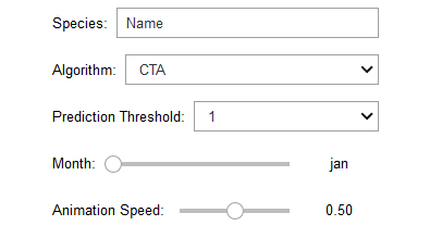
Just like that, the display statement takes all of those widget variables and shows them off in the Jupyter Notebook. Now the researchers have more power in choosing what to visualize and how to visualize it.
Widget intuition
So, how do you use it? In my experience, users are inclined to change the values around as appropriate, and then execute that cell containing the GUI. Widgets do not operate like this. The variables are active and responsive; the variable holds whatever value is set in the GUI (like CTA for Algorithm), and does not require cell execution. Cell execution resets the GUI and the variable values.
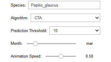
In changing the GUI around in this way, the variable name now has a value of ‘Papilio_glaucus;’ algo has ‘CTA;’ threshold has ‘10’ and so forth. These variables can now be used in other code.
# Import requirements
import os
import matplotlib.pyplot as plt
from PIL import Image as im

# Initialize the filename for each SDM.
filename = "./SDMs/" + name.value + "/" + month.value + "/" + algo.value + "-" + threshold.value + ".png"

# Check for file existence and then display the map (with a title).
if os.path.isfile(filename):
    print('----------------------------------------')
    print('Species: ', name.value)
    print('Algorithm: ', algo.value)
    print('Prediction Threshold: ', threshold.value)
    print('Month: ', str(month.value))
    print('----------------------------------------')
    img = im.open(filename)
    fig = plt.figure()
    fig.set_size_inches(14, 8, forward=True)
    fig.suptitle(name.value + ' - ' + month.value + ' - '+ algo.value + ' - ' + threshold.value)
    plt.imshow(img)
    plt.show(img)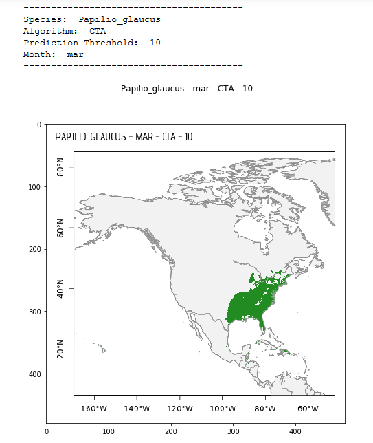
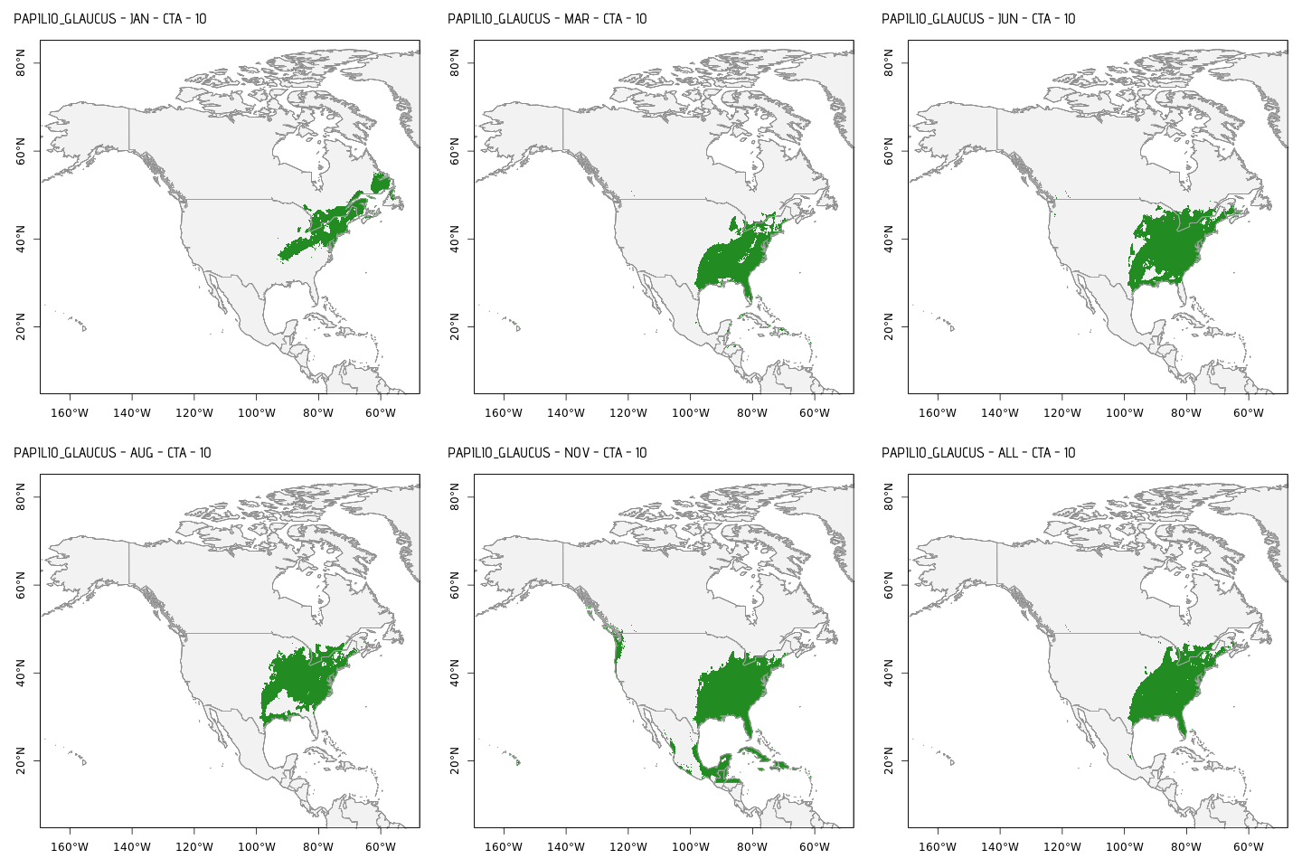
If the user desires, they can use the speed variable to change the speed at which the species distributions are animated (or in other words, how quickly they move across the map). This is all controlled by basic GUI objects: one textbox, two dropdowns, and two sliders. Of course, the way these variables are used will differ between projects (not all code is provided here).
Widget gotchas
In my experience, Jupyter widgets don’t play nicely with Github and nbviewer when it comes to simply viewing the GUI objects. It isn’t rendered properly. Here is an example of how the above widgets look in Github:
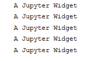
Maybe this will be fixed in the future. In the meantime, Github or nbviewer presentations will need to be replaced with live demos—the horror.